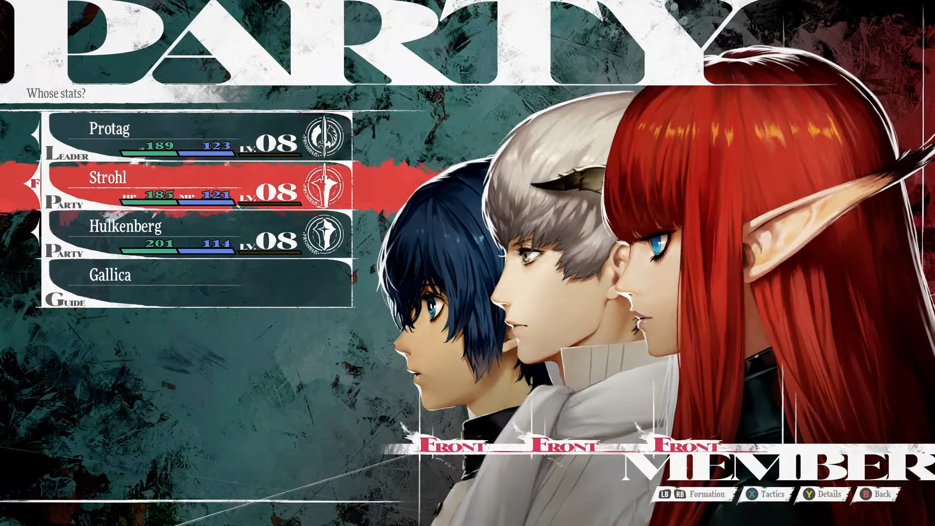
Koji Ise, lead UI designer on hit 2024 JRPG Metaphor: ReFantazio, joined Atlus in 2018 after spending a while working on website design in the advertisement space, as he explained at a GDC 2025 talk. “Metaphor was actually the first game that I designed for,” he said (via interpreter). “As the lead UI designer for Metaphor, I mainly handled the UI elements in general as well as the game title logo.”
Ise strolled into the industry and fired out some of the best UI to ever grace a JRPG, inspired but not defined by the likes of Persona and Shin Megami Tensei. But the process wasn’t easy. A lot of ideas got the axe, and Ise described crises of direction he experienced during development.
Going into Metaphor, the goal was for the UI team to establish a new art style, lead the game’s art direction, and create something that feels unique to this game, Ise said at GDC. Drafts and prototypes were drawn up, leaning into NES-era nostalgia or a fantastical parchment motif or sharp emotion, but nothing stuck. Some lacked uniqueness, others were too dark or too sophisticated and fiddly. Something was missing. Feedback was broad and unflinching, and Ise said that “after these comments, I lost my way, unsure of what direction to take next.”
“Around the time we proposed the colorful design, I began to really be conscious about our predecessor, the established Persona series,” he added. “I started to think that we might need a similar pop, stylized, and accessible design for the game as well.” But the design born of this direction “didn’t feel unique enough to stand on its own,” and lacked the heart of Persona.

Ise thanks director Katsura Hashino for giving him some valuable advice: “take a moment and stop listening to other people’s opinions so much,” and instead focus on what you want to achieve. “Those words really saved me,” Ise said.
Breaking free from fixations on Persona or more pop energy, Ise went back to the drawing board to find a new “guiding star to keep us on a clear path.” The solution? “Hyper stylish,” a way to interpret fantasy RPGs through Atlus’ lens “and create an art style that no one could keep their eyes off of.”
Four new design pillars supported this “hyper stylish” goal. Metaphor’s UI had to be cool, immersive, intriguing, and buzzworthy. “That’s when we decided to approach the UI design not as a standalone meta feature detached from the game’s world, but as an element that connects the player to the world of the game,” Ise explained.
This led to the interface that Metaphor fans know and love today – an eye-catching, lavish, but still pragmatic and navigable collection of menus that can compete with the best in the business, including Persona 5 Royal. People often talk about good UI being minimalist and out of the way, and sometimes it is, but Metaphor is another game that proves that loud, proud UI can play an active role in gameplay and embellish the experience.
In closing, Ise advised UI designers to focus on finding and expressing themes and ideas that only their game can achieve, incorporating symbolic expression to grip and surprise players (hint hint, Metaphor’s hero is lying down in the main menu), and forging unforgettable designs that can move people emotionally.


